
URL copied to clipboard

4 views
__readtime__ Min
read
1. Click on the button “Add Model”, at the top right of the model list and you will see the screen for “Model Information”.
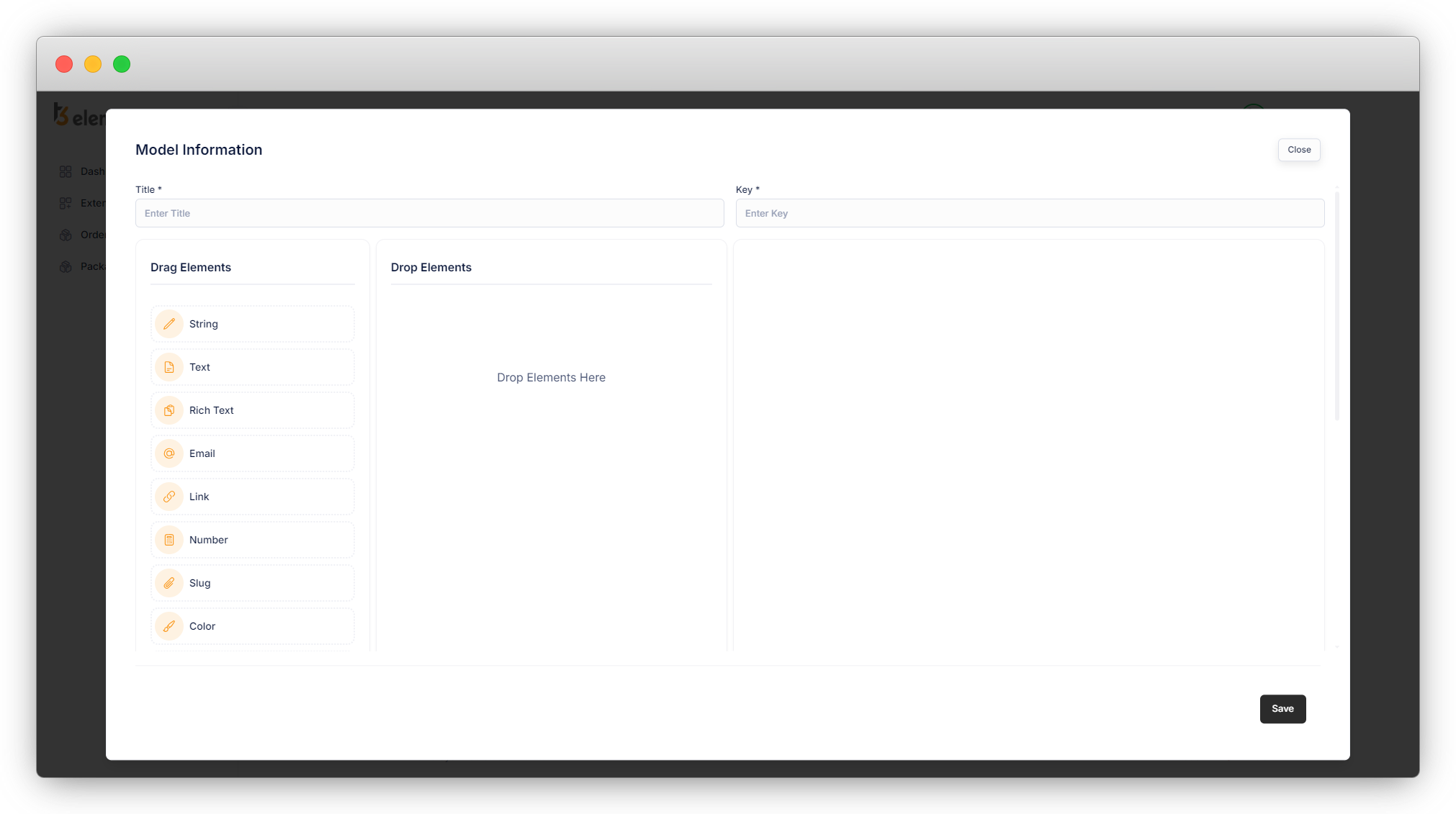
2. Here add the title for your model and the key will be generated automatically, you can edit the key once it is generated, be sure you are entering a valid key.
3. Now add the fields you want to add to your model/table.
4. You can add the elements by just dragging and dropping them into the “Drop Elements” column and it will appear as seen in the screenshot below:
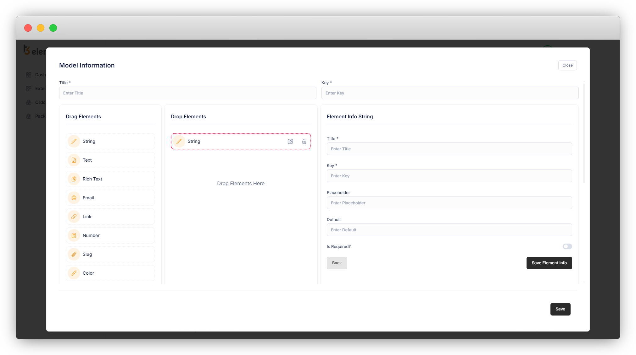
5. Click on the edit icon of that particular element and you will see fields on the right side. You will have to fill in the information of that element. Here the element is “String” in the below screenshot, so after clicking on the edit icon of the string element, you will see fields to fill in on the right side for the string element.
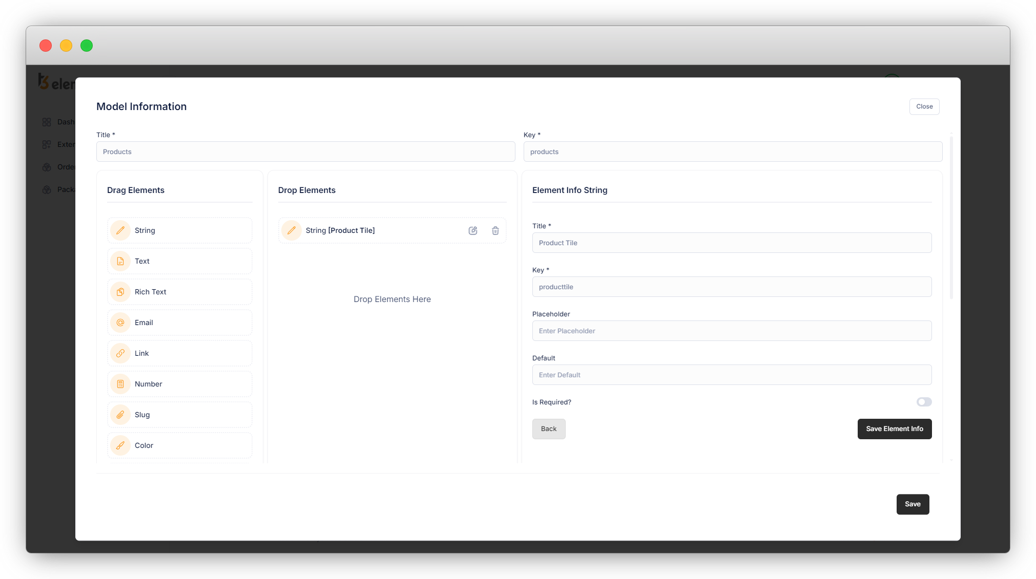
6. Fill in the fields of the element with the valid data, and click on “Save Element Info”.
7. Then add all the fields you want in your model, as seen in the screenshot below, and fill in the information for each element in the corresponding fields as illustrated above for the “String” element.
After adding all the fields click on the “Save” button and the model will be saved.
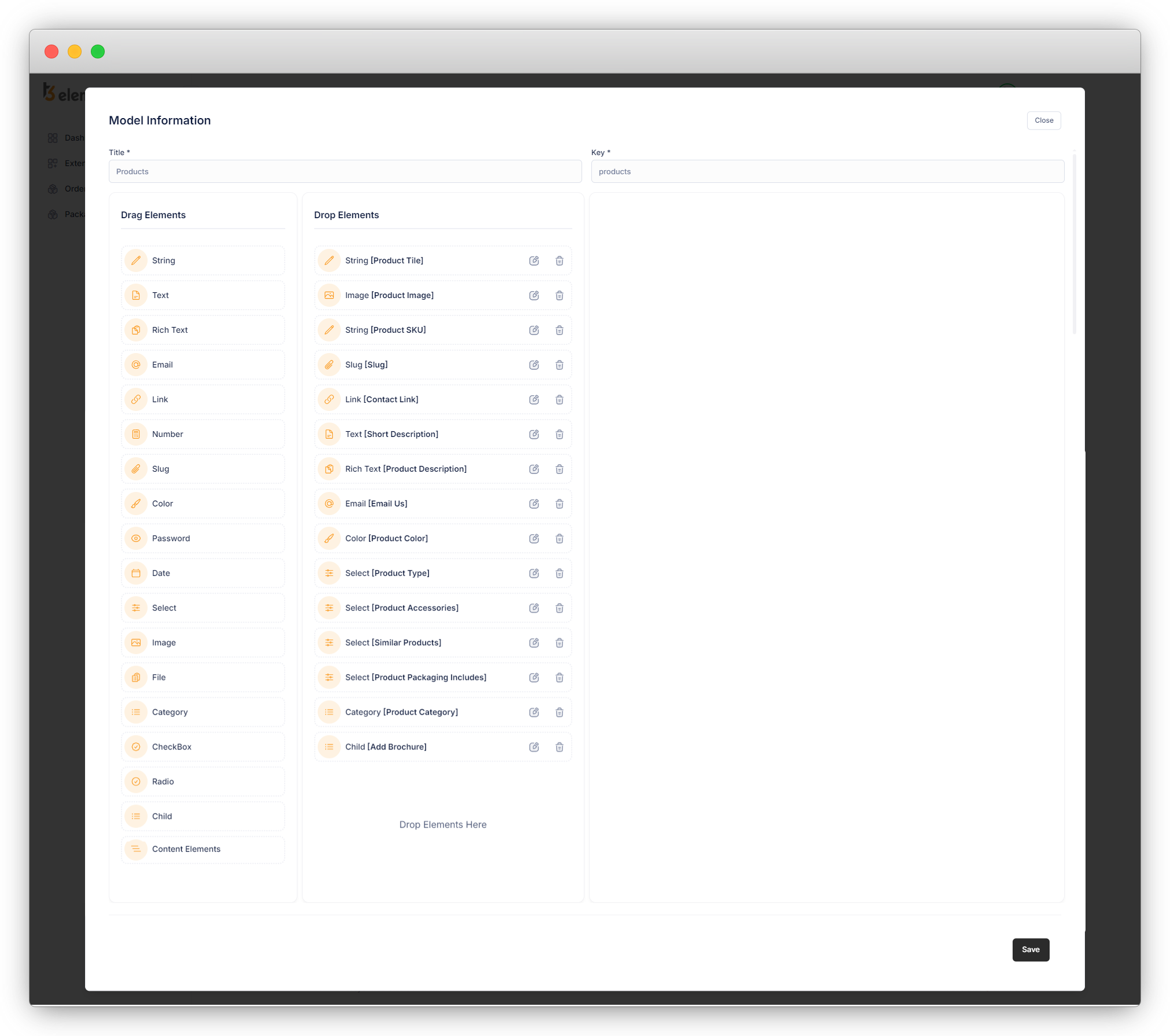
8. Below is an explanation of the fields that are used in the product model.
1. Product Title: A string element is used for the product title.
- Title: product title. [Required]
- Key: Key for the product title (auto-generated). [Required]
- Placeholder: Add a placeholder for the field if you want to add.
- Is Required: Check this checkbox if you want to make this field required.
2. Product Image: An image element is used for the product image.
- Title: Title for the product image field. [Required]
- Key: Key for the product image field (auto-generated). [Required]
3. Product SKU: A string element is used for the product SKU.
- Title: Title for the product SKU. [Required]
- Key: product SKU key (auto generate). [Required]
4. Slug: A slug element is used for the product slug. This field will allow us to set the slug for products
- Title: field title. [Required]
- Key: field key (auto generate). [Required]
- Generate slug based on: select the field option from the available options. Based on that selected option, your slug will be generated. If you don’t select any options from this field, the slug will be generated automatically and you will not be able to set the slug manually.
3.1. In this example, there are 2 options in this field as you can see in the screenshot below
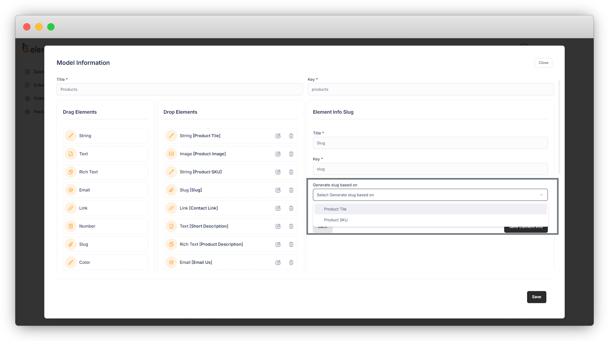
3.2. If you select any option from these options, the slug will generate automatically based on that, else you will have to set the slug manually.
5. Contact Link: A link element is used for this field. This can be used to add the URL (URL of the page/blog of the same website or any third-party website)
- Title: Title for the contact link field. [Required]
- Key: Key for the contact link field (auto-generated). [Required]
6. Short description: A text element is used for the short description. This field is added to show a short description of the product in the product listing.
- Title: Title for short description field. [Required]
- Key: Key for the short description field (auto-generated). [Required]
7. Product description: A rich text field is used for the short description. The use of this field is to add a long description for products, and as it is a rich text editor, it contains advanced styling options like heading levels, bold, italic, bullet points, font typefaces, and text size.
- Title: Title for the product description field. [Required]
- Key: Key for the product description field (auto-generated). [Required]
8. Email us: An email field is used here. This will validate the email at the time we add an email ID to the field.
- Title: Title for the email us field. [Required]
- Key: Key for the email us field (auto-generated). [Required]
9. Color: This field will provide a color picker to select the color. You can use the color in the template file for the inline style.
- Title: Title for the color field. [Required]
- Key: Key for the color field (auto-generated). [Required]
10. Product Type: Product type is used to select the type of product. The element “Single Select” is used here for the product type.
- Title: Title for the single select field.
- Key: Key for the product type
- Select Type: Select the type of select from here. In this field, the type “Single Select” is used.
- Add New Option: Added the static options for the select box.
11. Product Accessories: The product accessories field is used to select the accessories. The element “Single Select Box” is used for the product accessories.
- Title: Title for the Single Select Box field.
- Key: Key for the product accessories
- Select Type: Select the type of select from here. In this field, the type “Single Select Box” is used.
- Add New Option: Added the static options for the select box.
12. Product Packaging Includes: The product packaging includes is used to select the options for the packaging. The element “Select Check Box ” is used for the product packaging include.
- Title: Title for the Select Check Box field.
- Key: Key for the product accessories.
- Select Type: Select the type of select from here. In this field, the type “Single Select Box” is used.
- Add New Option: Added the static options for the select box.
13. Similar Product: A similar product is used to show similar products on the detail page of the product. The element “Select Multiple Side by Side ” is used for a similar product.
- Title: Title for the Select Check Box field.
- Key: Key for the product accessories.
- Select Type: Select the type of select from here. In this field, the type “Select Multiple Side by Side” is used.
- Add New Option: Added the static options for the select box.
14. Product Category: This will provide an option to select the category. It’s a default option of TYPO3.
- Title: Title for the product category field. [Required]
- Key: Key for the product category field (auto-generated). [Required]
- Is Required: Check this checkbox if you want to make this field required.
15. Add Brochure: A child element is used for this field. This will provide a repeating element which means a single element can repeat many times in design. To add multiple numbers of the brochure we have added the required elements – a string element for the brochure title and a link element for the link of the brochure file. In the TYPO3 backend, the group of those 2 elements will be added as a single element as a brochure.
- Title: Title for the Brochure. [Required]
- Key: Key for the Brochure (auto generate). [Required]
- Add New Button Title: Added title “Add New Brochure” for the button. (By clicking this button in the TYPO3 backend, you can repeat the element we created for the brochure.)
- Add New Field: By clicking this button you can add a new element. After adding the new element, select the element type and fill up the information for that field like title, key, placeholder, etc.
- String: Used this field for the “Brochure Name”
- Link: Used this field for the “Link Brochure File”
16. Launch Date: This will provide an option to select the date of the product launch. The element “Date” is used for this field.
- Title: Title for the date field.
- Key: Key for the date.
- Format: There are 4 formats of date. Select the date format as per your requirement. Here the selected format is “Date”.
17. Features: This will allow you to add the features of a specific product by checking the checkbox. The element “Checkbox” is used in this field with the select type “Default checkbox”.
- Title: Title for the checkbox field.
- Key: Key for the checkbox field.
- Select type: The selected type here is “Default checkbox” which will allow you to add simple checkboxes.
- Add new options: Add required options for checkboxes.
18. Product includes: This will allow you to add what will be included with the specific product by toggling the toggle button or toggle checkbox. The element “Checkbox” is used in this field with the select type “Toggle checkbox”.
- Title: Title for the checkbox field.
- Key: Key for the checkbox field.
- Select type: The selected type here is “Toggle checkbox” which will allow you to add toggle checkbox or toggle buttons.
- Add new options: Add required options for the toggle checkbox.
19. Extra: This will allow you to include extra things. The element “Checkbox” is used in this field with the select type “Labeled toggle checkbox”.
- Title: Title for the checkbox field.
- Key: Key for the checkbox field.
- Select type: The selected type here is “Labeled toggle checkbox” which will allow you to Labeled toggle checkbox and that can be enabled/disabled when you use them.
- Add new options: Add required options for the labeled toggle checkbox.
Share


