
URL copied to clipboard

Tables/Models
4 views
__readtime__ Min
read
1. After filling out the extension details, the next step is to add the tables/models for the extension.
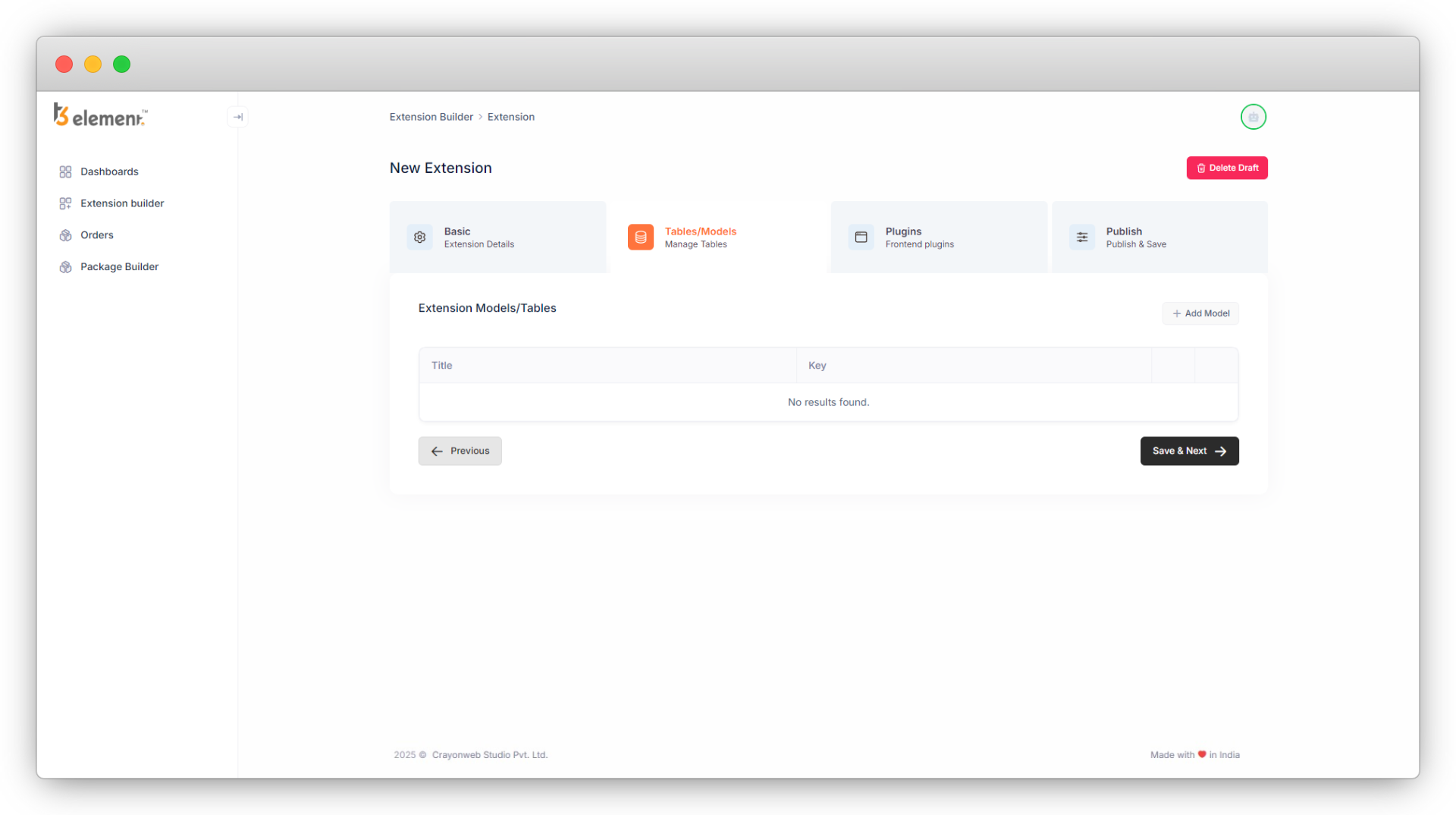
2. You will have to create tables/models for the things you want to perform CRUD operations in the “List” module of TYPO3.
- Suppose you want to perform CRUD for products, you will create the table/model for the products.
- There could be a “product type” for each product, so you can create a separate table/model of “product type” so that you can perform CRUD on the product type too.
3. Click on the button “Add Model”, at the top right of the model list and you will see the screen “Model Information”.
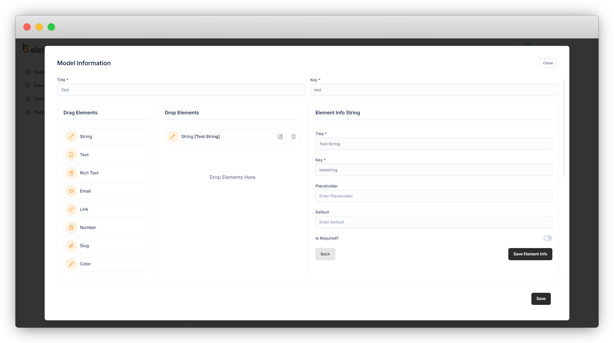
4. Here add the title for your model and the key will be generated automatically, you can edit the key once it is generated, but be sure you are entering a valid key.
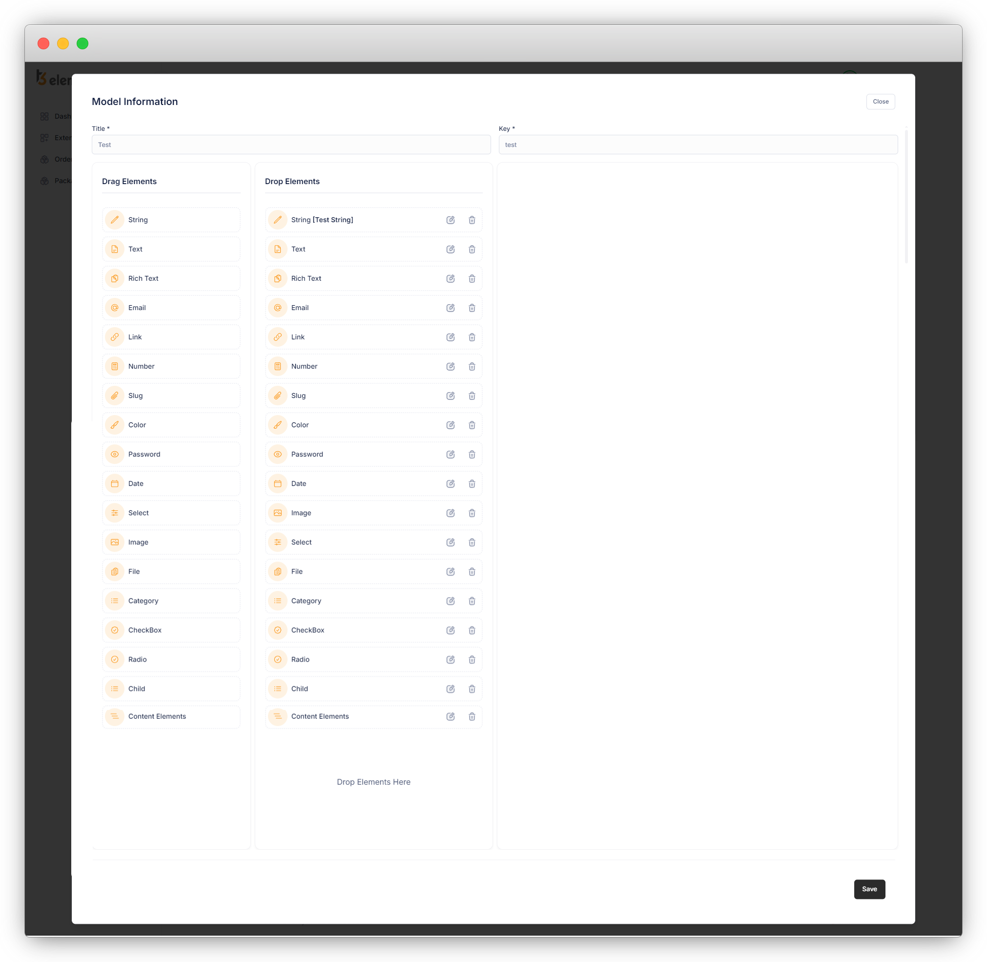
5. Now add the fields you want to add to your model/table. There are many fields and you can use multiple fields multiple times as per there requirement. You can refer to the field explanation at the end of this topic.
6. You can add the elements by just drag and drop them into the “Drop Elements” column.
7. Click on the edit icon of that particular element/field and you will see a form of Element Info on the right side.
8. Fill up the form of the element with the valid data, and click on “Save Element Info”. Below is the example of creating the new table “test”. As you click on the “Add Model” button you will be able to add a new table/model, add title, key and fields for that table/model.
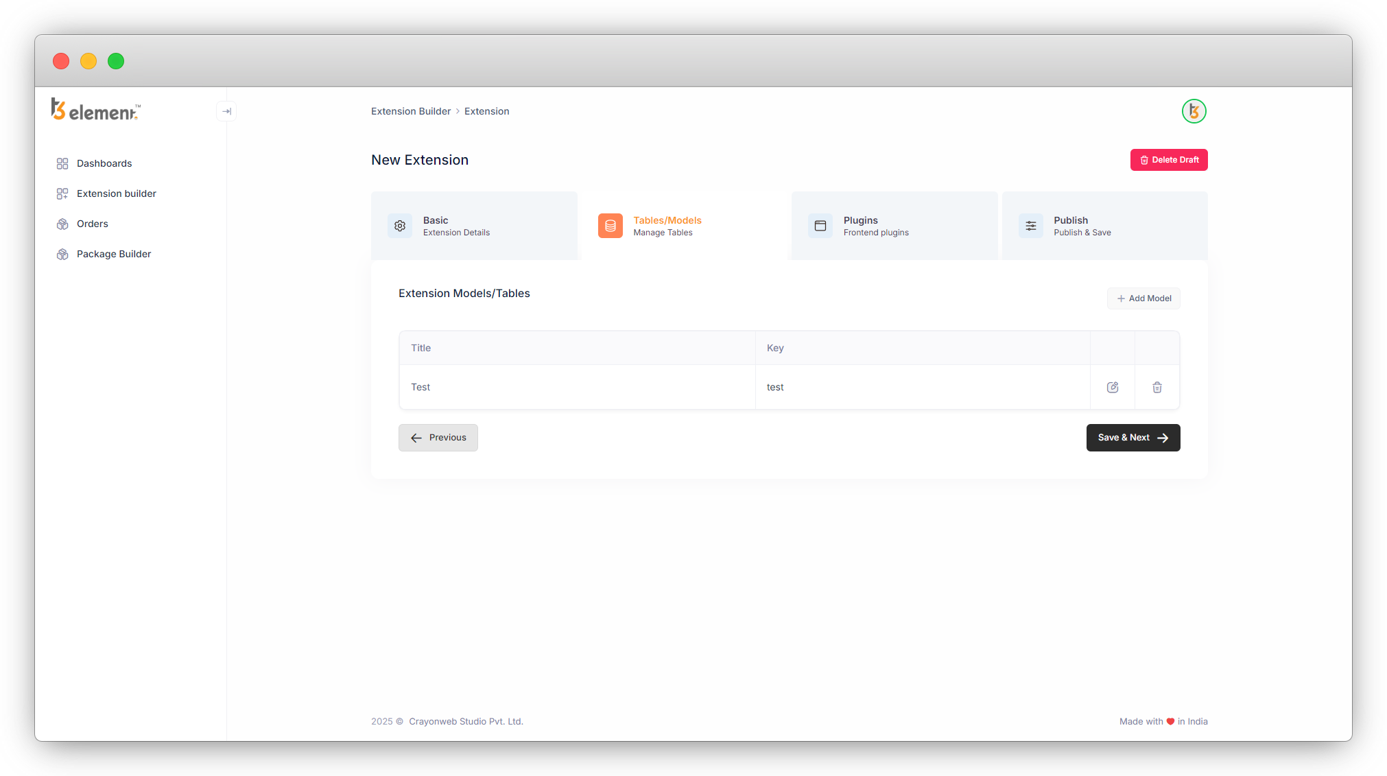
Then add all the fields you want in your model and click on the “Save” button and the model will be saved.
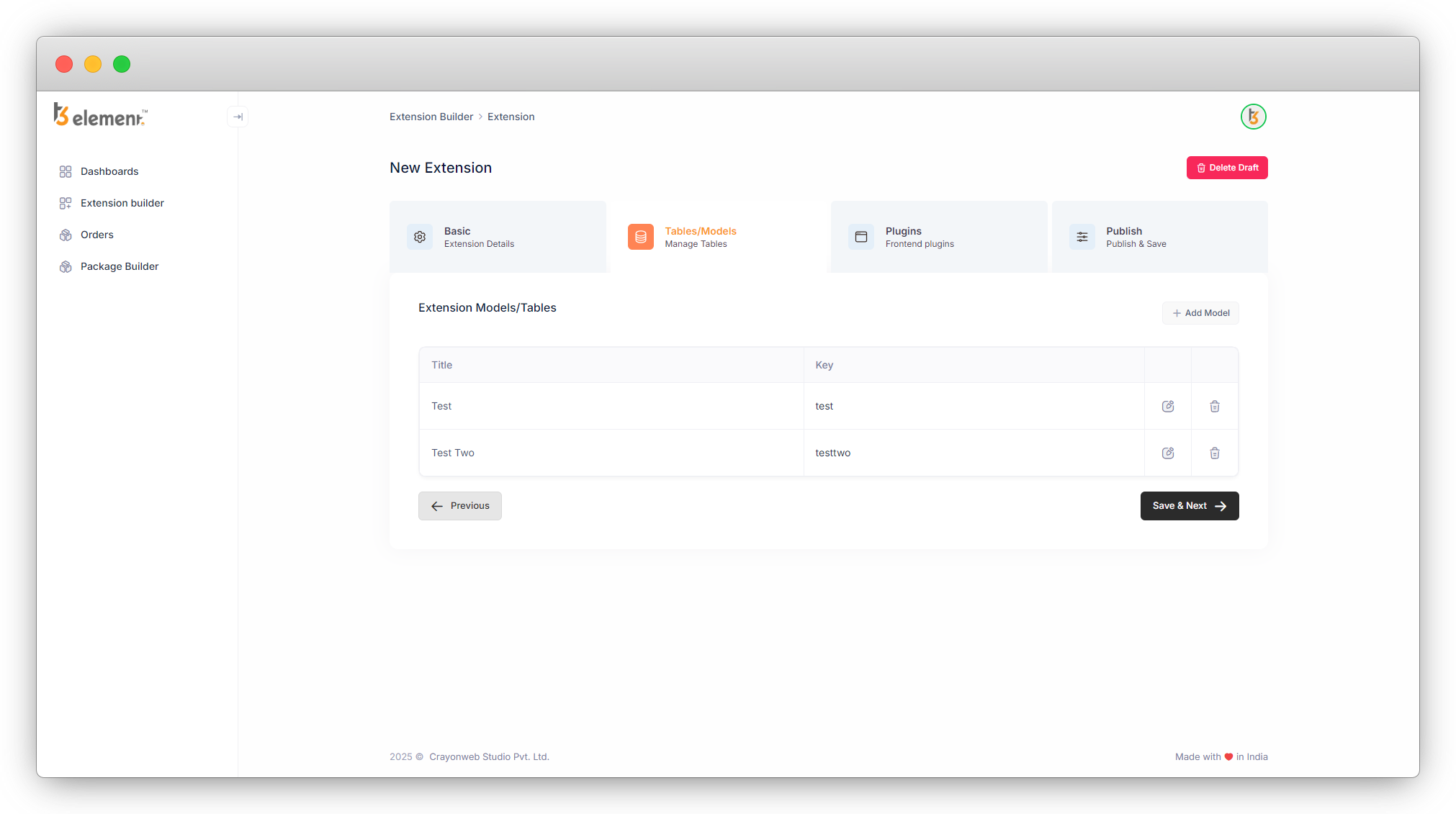
You will be redirected to the list of Tables/Model. As you can see in the screenshot below, there are icons of edit and delete in the far right of the table/model.
8.1. Edit icon: You can edit the table/model by clicking this icon. You can edit any information like title, key or fields you have added. You can add more fields, remove fields or edit the information in the fields.
8.2. Delete icon: You can delete the table/model by clicking this icon. But before deleting any table think twice and be sure that you haven’t used that table in any another existing table as a field otherwise the data will be lost and there is no option of restoration.
For example let’s create a new table “Test Two” and add any field to that table.

Then add a new field in the existing table “test” and use the new table “Test Two”. Let’s add a new field “select” in the “Test Two” table, and select the old table “Test” for fetching the data of as a dropdown items for the select field.
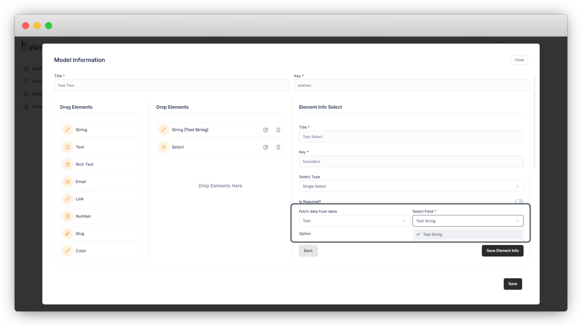
8.3. Then save the element info and save the table “Test Two”. Now delete the table “Test” by clicking the delete icon from the list of tables/models:
8.4. After deleting the table “Test” now check the table “test” for the select field where we used the “Test”, and you can see in the below screenshot that we lost it.
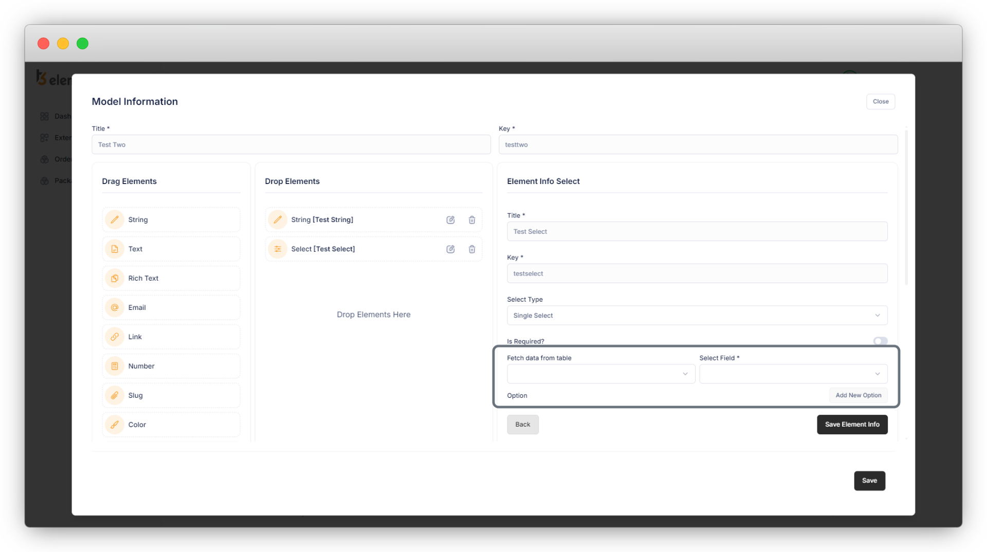
8.5. So before deleting any table just be sure that the table is not used as a field in any other table.
9. Below is the field explanation:
1. String: This is input with the type “text”. It can be used for the fields like title.
- Title: field title. [Required]
- Key: field key (auto generate). [Required]
- Placeholder: Add a placeholder for the field if you want to add.
- Default: Add the default value if you want to show any default value for the product title.
- Is Required: Check this checkbox if you want to make this field required.
2. Text: This is a text-area field. It can be used for a field like a short description.
- Title: field title. [Required]
- Key: field key (auto generate). [Required]
- Placeholder: Add a placeholder for the field.
- Default: Add the default value if you want to show any default value for the product title.
- Is Required: Check this checkbox if you want to make this field required.
3. Rich Text: It is a text editor. This can be used for the description with all the text editing options.
- Title: field title. [Required]
- Key: field key (auto generate). [Required]
- Placeholder: Add a placeholder for the field.
- Default: Add the default value if you want to show any default value for the product title.
- Is Required: Check this checkbox if you want to make this field required.
4. Email: This can be used to add the email address.
- Title: field title. [Required]
- Key: field key (auto generate). [Required]
- Placeholder: Add a placeholder for the field.
- Default: Add the default value if you want to show any default value for the product title.
- Is Required: Check this checkbox if you want to make this field required.
5. Link: This can be used to add the URL (URL of the page/blog of the same website or any third-party website)
- Title: field title. [Required]
- Key: field key (auto generate). [Required]
- Placeholder: Add a placeholder for the field.
- Default: Add the default value if you want to show any default value for the product title.
- Is Required: Check this checkbox if you want to make this field required.
6. Number: This can be used to add the numbers.
- Title: field title. [Required]
- Key: field key (auto generate). [Required]
- Placeholder: Add a placeholder for the field.
- Default: Add the default value if you want to show any default value for the product title.
- Is Required: Check this checkbox if you want to make this field required.
- Format: Select the format of a number field.
7. Slug: Set the slug of that particular page/blog you are creating from the list module of TYPO3.
- Title: field title. [Required]
- Key: field key (auto generate). [Required]
- Generate slug based on: select the field option from the available options. Based on that selected field, your slug will be generated. If you don’t select any options from this field, the slug will be generated automatically and you will not be able to set the slug manually.
- Is Required: Check this checkbox if you want to make this field required.
8. Color: This should be used to render a JavaScript-based color picker.
- Title: field title. [Required]
- Key: field key (auto generate). [Required]
- Is Required: Check this checkbox if you want to make this field required.
9. Password: should be used for input values that represent passwords.
- Title: field title. [Required]
- Key: field key (auto generate). [Required]
- Placeholder: Add a placeholder for the field.
- Default: Add the default value if you want to show any default value for the product title.
- Is Required: Check this checkbox if you want to make this field required.
10. Date: should be used to input values representing a date time or datetime.
- Title: field title. [Required]
- Key: field key (auto generate). [Required]
- Format: Select the format of the date according to your requirements.
- Date: It stores the calendar date.
- DateTime: It is used for values that contain both date and time parts.
- Time: The time data type stores time values using a 24-hour clock.
- Timesec: The value of TimeSec relates the t=0 point of the trace to another point in time, and depends on the Data Source setting when the data was acquired.
- From Recording: offset from the t=0 time of the recording (TimeStamp)
- From Hardware: offset from the t=0 time of the data of the first measurement after measurement restart.
- Is Required: Check this checkbox if you want to make this field required.
11. Select: By the “select” type you can create selector boxes. In the most simple form, this is a list of values among which you can choose only one.
- Title: field title. [Required]
- Key: field key (auto generate). [Required]
- Select Type: Select the type of select box from below: (we will check these options in deep into the example)
- Single select: Allow to select only one option from.
- Single select box: Allow to select multiple options from the select box, press CTRL key while selecting multiple options. Also, there is an option of Revert selection on the top right side of the select box.
- Select check box: Checkboxes that allow selecting multiple options and also an option of “Toggle all” to select/deselect each option. Also, there is an option of Revert selection beside the “Toggle all” option.
- Select multiple side by side: allow to select the options from all the available options. All the options do exist on the right side, you can select the options from there and the selected options will be visible on the left side box.
Also, you can delete the option from selected items. Select the option from the left side and click on the delete button and that option will be deleted and will move to the right side box.
- Is Required: Check it if you want to make this field required.
- Fetch data from the table: You can select the existing table from here if you want that particular table’s field as an option for your select box.
- Select field: If you select the field from the “Fetch data from table” field, then you will see a new field “Select Field” beside it. Here you can select the field from the table that you want to show as an option.
12. Image: Image field
- Title: field title. [Required]
- Key: field key (auto generate). [Required]
- Is Required: Check this checkbox if you want to make this field required.
13. File: Add files
- Title: field title. [Required]
- Key: field key (auto generate). [Required]
- Is Required: Check it if you want to make this field required.
14. Category: It works as the TYPO3 default category
- Title: field title. [Required]
- Key: field key (auto generate). [Required]
- Is Required: Check it if you want to make this field required.
15. CheckBox: By the “CheckBox” type you can create selector boxes.
- Title: field title. [Required]
- Key: field key (auto generate). [Required]
- Is Required: Check it if you want to make this field required.
- Select type: Select the type of the checkbox.
- Default Checkbox: Allow to select the option by checking the checkboxes. You can check multiple checkboxes.
- Toggle checkbox:
- Labeled toggle checkbox:
16. Radio: You can select any one option from all the given options by using radio buttons.
- Title: field title. [Required]
- Key: field key (auto generate). [Required]
- Is Required: Check it if you want to make this field required.
- Add New Option: Add the options for radio to select.
17. Child: By using this element you can create a repeater element. It repeats a single element many times. Suppose you want to create an element that contains a title and an image and want to repeat the element many times, and also want flexibility on the count of that element so that on one page you can repeat that element 3 times, and on the second page you can repeat it 10 times, then you can do that by using the child element.
- Title: field title. [Required]
- Key: field key (auto generate). [Required]
- Add New Button Title: Title for the button. (By clicking this button in the TYPO3 backend, you can repeat the element (a group of multiple elements).)
- Add New Field: By clicking this button you can add a new element. After adding the new element, select the element type and fill up the information for that field like title, key, placeholder, etc.
10. You can add multiple models/tables for your extension, create them, and click on the “Save & Next” button and you will see the screen of “Front End Plugin”. Let’s see the front-end plugins.
Share


